- Global Small Spaces
- Season 1
- Episode 1
How an Interior Designer Maximizes Her 650 Square Foot Studio Apartment
Released on 08/06/2024
[upbeat music]
I really enjoy living in this small space.
I feel like it's very practical.
It kind of has everything I need and feels very intimate.
I wish I had a bigger house.
I'm joking. [laughs]
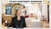
I'm Christie Ward.
Welcome to my 650 square foot apartment in New York City.
When I was studying at Parsons,
I met my now business partner, Staver Gray,
and we then started Ward + Gray about four years ago,
focusing on boutique hotels.
I love designing hotels.
I like how they can be experiential and fun
and you can take a bit more of a risk with them.
When designing this apartment,
I really thought of it as a hotel.
The space is about the same for a large hotel room.
So I thought in the same way,
how do I create rooms within a room?
It is a studio apartment,
but I wanted to have a dining space,
a living space, a workspace,
and creating all those little nooks
was something very important to me.
The first time we walked through the apartment,
every single wall was a different color.
So there were avocado green walls in the living room,
pink and purple walls in the bathroom and in the kitchen.
And I was excited because I saw all this opportunity here.
So I started drawing all these options for the floor plans.
The idea was to bring as much function as possible into it.
[soft music]
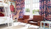
This is our living room.
When we first saw this apartment,
one of our favorite things was that
we were just across from two parks actually.
So you get a lot of greenery in the space
and you kind of get a break from the city.
So I wanted to bring that color through
into the fabrics here.
I had Photoshopped this room with a really deep navy first,
but then when I got here
and started putting color on the walls
as test runs,
I saw that the lighter color
just really opened up the space more
and that's kind of what we needed here.
For our chandelier,
we had it made with a glass master
and I pulled that same green that you see from the park
and on the wall sconces into the chandelier
with the light blue that's also in our kitchen.
So it just kind of helped to tie that room together.
The sofa has been with us
through our whole time in New York.
And when we moved in here,
we thought why not keep it?
So we decided to reupholster it
in these really fun and lively colors.
And then we have this credenza on this side,
which is just kind of the focal point of the room
and it kind of showcases the art.
These are fish I found,
they're little ceramic ones.
Every summer we like to go to Praiano
and in their alleyways,
they stick ceramic fish into the stucco walls.
And I always thought that was such a beautiful idea.
And so I've been collecting them
kind of thinking of doing that
for a future project or house.
I love this lamp in the corner as well.
It's really fun because you can kind of tilt it.
If you're reading here, just hanging out.
I thought what was nice is that it just kind of
makes the room feel a bit taller being installed higher.
It just creates a lot of height in the space.
This room used to be a lot bigger
because it was an open floor plan before
for the bed and the living space.
We did decide to cut it off and make it two spaces
so that we had more privacy into the bedroom.
And I think that helped to create
a more intimate space here.
To us, I think making it smaller
actually made it a bit more functional.
[upbeat music]
This is our bedroom.
So we're just off the living room,
which we separated by this glass and metal divider.
We knew we wanted to have some sort of separation
between the living room and the bedroom.
And so I came up with the idea
to do a glass and metal divider,
something I did previously in a project for Soho House.
We were trying to separate there
the bedroom and the bathroom,
but here I thought that was a great solution for privacy.
We are really deciding between a ribbed glass
or a clear glass.
And ultimately I really wanted to get that natural light
when I woke up in the morning.
Sometimes I like to just hang out in bed,
have a cup of coffee on the weekends.
And I wanted to feel like it was morning
and I could see what was happening in the city
without feeling too disconnected.
So that's why we ultimately decided
to go with the clear glass.
This bed I designed with a factory actually in Portugal
and the fabric we custom designed for the bed.
So we've pulled out that green that's in the wall sconces
and used the same color to create this hand block stripe.
My favorite detail of this bed is the fringe at the base,
which is really fun and playful.
The position of the bed was important.
At one point I had moved it over to the side
and played around with a little bedside table,
but ultimately you really wanted the space
on either side of the bed to just free up the space,
feel a little lighter
and not like you're smushed up into a corner.
The challenge I think with living in a small space
is having self-control,
not to buy everything you see in an antique shop
or when you travel,
you just have to know what you need and not over-purchase.
But it is nice to collect.
[upbeat music]
This is our kitchen.
When we first saw this space,
the previous owner had cabinets
that were on either side of us
and we felt like we wanted to open it up.
With this space, we really
wanted it to function as a kitchen,
but also as a workspace.
So we actually cut this countertop in here
to create this little nook.
And we added the bar stools
and this is actually what we use as a little workspace.
And then we added these upper shelves here
so we can just put our little objects.
And then in the cabinets,
we actually used this clear glass on top
so that it felt more open.
And we also had beadboard done at the back of the cabinet
just to add that nice little detail.
The biggest challenge with this space is it's very narrow.
So we had to be really thoughtful
about what we were putting in here.
We knew we had to have a full-size range and fridge,
but the idea to hide the fridge away in this panel
really helped so it doesn't feel like a ton of equipment.
It just kind of looks like nice, thoughtful cabinetry.
And then here we did this marble shelf that's open
and we just store little objects on here
and things we collect.
But I think it makes the space kind of feel
less like a kitchen and more like another room of the house.
There's this painting here by the amazing Frankie Thorpe
and we commissioned her to do it based off Praiano,
a place we go every summer.
Frankie actually included this glass
from our Moncada Home Collection spike
and we named him after our favorite character
from Notting Hill.
We went with Farrow & Ball light blue
for the cabinetry in here.
And we felt like that gave it a very calm feel.
It just feels kind of soft and nice.
And then we use a honed Kura marble for the countertops
and that just lightened everything up even more.
We're really lucky to have this window here
that looks out to a beautiful park
so that brings in a lot of light.
We used a nice linen shear
and I think that just creates this ambient glow.
What I love about this space is it's really multifunctional
so when I'm here cooking or chopping,
my husband can kind of perch on these bars tools
and hang out.
And it's just nice in such a small space
to be able to both be in here
and be doing two things at once, but it still works.
If I could change something about this space,
I might add a door
because we do get some light leakage into the bedroom
mostly because these are sheer curtains,
but I think it's worth it for the nice arch
we get coming into the space.
[soft music]
This is our dining nook.
Previously, this was one big wide corridor.
The old owner had a big cabinet here
and it was kind of overwhelming the space.
It felt very tight.
This was one of the things I wasn't sure
if I was going to invest in.
On the floor plan,
it felt like maybe it wanted to stay a wide passageway
into the living room and bedroom,
but I'm actually really happy I did this
because it created a whole new room within this room.
And it's one of the most used spaces in our house.
We decided to eat into this wall
to create this built-in millwork piece.
We did it in the same light blue
since it's right across from the kitchen
and then added the same bead board details
that's behind the kitchen cabinets.
And this just created a ton of storage for us
so on the right and left side,
we have wardrobes here
and then below the little nook bench,
we also have storage.
When we have people over,
our friends can kind of hang out here,
perch on these chairs,
and then I'm in the kitchen,
but it's very social 'cause there's no door
and so everyone just kind of gets to mingle.
So with small spaces,
I feel like storage is always the biggest issue.
So for us, adding this whole corridor of closets
was really impactful for us.
These were formed by our contractor
and he was using this kind of bendy plywood
that took the corner
and then he hand-plastered over.
This is actually a Art Deco building.
It was built in the '30s
and the plaster was original to the building
so we wanted to make sure we used that here as well.
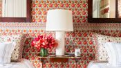
This is our bathroom.
When we first started doing the layouts for this space,
we toyed with the idea of making the bathroom bigger.
But ultimately, I thought storage was more important
for our clothes and things like that.
I think it was the right decision in the end.
We have so much
and trying to pack it all into a studio can be tough
so I think the storage was a better use of space.
The bathroom is quite tight
so we used this light blue color to open it up
and make it feel a little bit larger.
I couldn't find a 24-inch wide vanity off the shelf
so I really had to custom make this one.
It's a very tight space
so easing the corners of the backsplash really helped
and I think makes it feel less angular
and gives a nice kind of flow.
The mirror has these eased edges.
It's actually a polished nickel
but I thought it just spoke to the rest of the apartment
with the curves.
I used the same sconce that I used throughout the house
with that green just to tie in the colors.
[soft music]
The whole process took us about a year
but I feel like it wasn't that grand moment
when you walk into a space and it was finished
because I little by little was finding furniture and lights
and it's still never really done.
This was the first apartment I have designed for myself.
I think having done it once
now I just want to keep doing it again and again.
The important thing I think in a studio apartment
is just making sure everything is functional
and has a purpose.
I think we've managed to fit a lot in here.
We have our little dining space,
a bedroom, living room, workspace.
I think that's quite unique in a studio
and also I guess our things make it unique.
They feel uniquely us.
[soft music]

How an Interior Designer Maximizes Her 650 Square Foot Studio Apartment
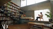
How an Architect Fit 7 Floors into His 645-Square-Foot Tokyo Home
5 Clever Ways to Modernize a Dated Home with Pattern
3 Unexpected Ways to Decorate with Color

Architect Breaks Down 5 of the Most Common Houses in L.A.
Pro Designer Fixes a Dark, NYC Studio Apartment With No Storage

How Central Park Was Created Entirely By Design and Not By Nature

AD100: The New Taste
Inside a Minimalist Capsule Home Overlooking the British Coastline
3 Interior Designers Transform The Same Dated 90s Living Room