- The Blueprint Show
- Season 1
- Episode 28
The Secret to Good Airport Design: Aesthetic vs Efficiency
Released on 10/08/2024
Most people don't wanna spend more time in an airport
than they have to.
That makes efficiency the number one job for airport design.
But for the time you do spend there,
you want it to be pleasant, comfortable,
and maybe even beautiful.
Hi, I am Michael Wyetzner,
I've been an architect for over 35 years.
And today, we're gonna be talking about the secret
to good airport design.
And why it's so important
to balance the expediency and experience of your time
in the airport.
First of all, airports, originally,
were designed primarily just for function.
They started as military and government facilities,
which were just hangers and sheds
and dirt landing strips in a field.
As flight became more accessible
and more people traveled by plane,
airports needed to be much larger to accommodate the demands
for all these new passenger flights.
They now needed to include spaces for check-in,
baggage claim, gates for waiting at,
and food service and other retail.
I mean, the idea of a large airport
was a totally new typology.
They could have made them look like train stations,
but they didn't.
They were searching for a new language for their design.
They maintained some of that utilitarian feel
because efficiency and cost were still factors.
But at this point,
most of them just ended up looking like office buildings.
At that point,
efficiency became even more important than before.
Airports needed to accommodate
and still do three modes of traffic,
people, bags, and flights.
And the way they did this
was to separate the passenger traffic vertically
based on whether you were arriving or departing.
So, typically, airports are designed on two levels.
One level is for bags, one level is for people.
Airplanes are very tall.
So, typically, when you enter the airport
for your departing flight,
you are entering on the upper level
because that's where you enter the plane at.
And when you arrive at your destination, typically,
you are on the ground level
because that is the level in the airplane
that the bags are located in.
And so those bags come in directly and you grab your bag
and go out to the street level to get your taxi,
your Uber or your Lyft.
As airports continued to grow, they became more complex,
not only in their configurations,
but in the variety of spaces that they offered.
Airport security began to take up a much larger footprint.
And over the years, food service and retail
became a massive part of the floor plan.
Travel efficiency and retail economics were the main factors
in airport design for many years.
But the aesthetic aspect of their design
didn't progress beyond imitations of office buildings
until one specific terminal significantly changed
the dynamics of airport design, driven more by aesthetic.
And the experience of visiting the airport itself
rather than treating it just as a transitional space
between a car and an airplane.
And the turning point in this aesthetic evolution
can be traced back to a single terminal
that was completed in 1962
at what was then called Idlewild Airport
and is now called John F. Kennedy International.
This is the TWA Flight Center designed by Eero Saarinen.
So, Saarinen had just completed
the General Motors headquarters in Michigan,
which had gotten a lot of acclaim and a lot of attention.
He designed a lot of very unique buildings,
all different from one another
including the hockey rink at Yale University.
So, Saarinen was chosen for this project
because he was known as a visionary.
No two buildings he did were ever the same.
And he was actually designing another very famous airport
called Dulles Airport outside of Washington
at the very same time.
And for this project, he wanted to design a building
that evoked the excitement of air travel.
So what Saarinen did to evoke this idea of flight
was he created these swooping grand curves
and lifted them up almost like wings would lift up
above this portion of the building.
And he almost created
what appears to be like the beak of a giant bird,
and to some that was a little too picturesque.
And he was actually criticized for it.
But there's no denying that this building itself,
the interior as well as the exterior,
evokes the idea of taking off and flying through the air.
And what's most remarkable about this
is this was done in an era before computers.
So all this was designed as it were by hand.
The building has these multiple compound and complex curves.
And in fact, he couldn't even draw it.
They basically just kept building
model after model after model, and then they drew that.
So let's take a look at the interior of the building,
which is in many ways
is even more exciting than the exterior.
I mean, it's incredible actually.
He creates these extremely dynamic, swirling forms
on the interior.
And then the roof of this building,
which comes down and forms the walls
and the entire enclosure for the interior
is actually made of four separate folded shells.
And he separated each of these shells
with this linear skylight.
And for me, this sort of represents the pinnacle
of the glamour of air travel in the early 1960s.
The era of President John F. Kennedy,
the space race, the innocence before Vietnam
still basking in the victory of World War II.
And I think this building by Saarinen
contributed more to that feeling
than any other building of the era.
In that, it's the expression of flight
and the sense of discovery that comes with air travel.
So the way Saarinen designed this airport
was there's this great terminal,
but then you've gotta go through these long tubes
to get to these gates
where the planes are to board your flight.
You could see the tubes clearly here
and through this window here.
So when you get off your flight
after coming out of this tube of an airplane,
he brings you into this other tube,
this really evocative,
almost like the esophagus of a giant animal
that you walk through.
And then you emerge from this tight dark space
into this bright and luminous airport terminal.
Saarinen created this place
that you weren't meant just to walk through,
but you were actually meant to linger and enjoy
and get a sense of the excitement of air travel.
Typically, when you arrive at an airport,
the last thing you wanna do is linger.
I mean, it's been hours since you got in the car
or the train that brought you to the airport
until you waited, until you got on your flight,
until your flight finally landed.
So the first thing you wanna do
is get to the baggage carousel as quickly as possible,
collect your belongings, and be on your way.
You don't linger to look at the architecture,
but occasionally one is struck by something amazing,
and that's what happens at TWA.
You come out of your plane into this long tube,
which brings you into this amazing space below,
and it gives you a sense of what a great airport can be.
Suddenly, you realize you're in a new and exciting place,
and that's what a great airport can give.
Some other airports that have also created this feeling
are Barajas in Spain by Richard Rogers,
Kansai in Japan by Renzo Piano,
the Jeddah Airport in Saudi Arabia by SOM,
and Dulles Airport, of course,
outside of Washington DC, also by Saarinen.
The thing about air travel today
is it's extremely safe and extremely affordable.
So because of all this,
people are spending more and more time at the airport.
And so one would like them to be as beautiful as possible.
So now let's take a look at an airport
that takes that idea even further,
Daxing International Airport in Beijing, China.
So this is the largest airport building in the world
designed by Zaha Hadid Architects.
Here's everything jumps out at me.
First off, it's the massive scale of this building.
The building footprint is so large
that the runways almost look diminutive in comparison.
And it obviously takes a lot of cues
from what Saarinen did at TWA
in terms of its plastic curves and organic shapes.
It almost looks like some sort of living marine creature.
In fact, it's nicknamed The Starfish.
The other way in that it relates to TWA
is that it also has these linear skylights,
these separation of the shells.
So in a way, it's this series of boomerang shapes,
these parabola that all sort of meet
to form this radial construction.
And in the center, there is this lattice work
of this amazing skylight, which we'll show you from within.
And speaking of skylights,
each one of these little domes are actually skylights.
And in fact, if you look at it from the roadway,
it looks very reminiscent of the TWA terminal at JFK.
And you could see with this large overhang
and the way the form lifts up
and it's filled in with glass below
is very reminiscent of what Saarinen did at TWA.
But it's not just beautiful on the outside.
This building is really quite incredible from the interior.
So these two photos give you a great view of the interior
and the skylights that flooded with natural light.
And I mentioned the vortex at the center of this form,
that lattice skylight, well, this is it from the interior.
And you could see the linear skylights that separate
each one of those parabolic boomerang like shapes
from one another.
And this is one of those small,
almost elliptical shaped skylights
that you saw from the roof.
And it just gives you an idea of the massive scale
of this building that that tiny little oval
that we saw on the roof
is actually compared to a person is an enormous size.
And you could see the excitement on the interior.
I mean, this actually, you know you're at an airport,
here's the check-in counters, here's baggage,
and then here you see all these amazing shapes,
and I love that she did this suspended arch,
which looks like it's just floating in midair,
and then she suspends the bridge from it.
It's this dynamic, amazing environment
that totally envelops you, where it's hard to distinguish
between floor, wall, and ceiling.
One thing grows out of the other.
So clearly, the experience of being here was forefront
in the designer's minds.
The idea was let's create an amazing place to be.
Okay, so let's talk about Zaha Hadid.
Truly one of the great architects
of the late 20th and early 21st century.
She was hugely influenced by a group of artists
known as the supremacists
who were Kazimir Malevich, EL Lissitzky, and Liubov Popova.
They were called that because they were interested
in the supremacy of pure artistic feeling
as opposed to just the visual depiction of objects.
And Zaha was also a painter.
Through her paintings, she explores spaces
that architecture hasn't considered before.
So these paintings foreshadow her early built work,
such as the Vitra Fire Station in Switzerland,
and the Rosenthal Center for Contemporary Art in Cincinnati,
which are all very hard-edged and rectilinear
and don't employ those soft curves yet.
At the MAXXI Museum in Rome, she starts to soften her form
and creates these more curvilinear shapes,
which over the years leads to the astonishing forms
that she employs at Daxing.
Sadly, she died in 2016 before its completion,
but her stamp is all over it.
And truly, she's one of the great architects
of the 21st century.
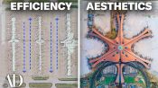
But Daxing is not just beautiful,
it's also extremely efficient.
So this aerial view really shows the efficiency
of this radial hub and spoke concept
of which this airport is designed.
So, basically, what this hub and spoke concept means
is that no gate is too far away from the center.
In fact, it's only an eight minute walk to the farthest end
of each one of these piers.
So this concept is incredibly pedestrian friendly
because it means you don't have to walk
all these great distances like you do at other airports.
For instance, at Dallas Fort Worth,
it's over two miles to the furthest gate,
which is 40 minutes of walking time.
So this radial concept also means
you don't need other forms of transportation
to get around the airport.
You don't require buses, shuttles, or trains.
Of course, this shape, which is so efficient for passengers,
is actually a somewhat common arrangement for terminals.
So, Daxing, although it's radial,
is actually based on the pier concept.
And the pier concept when arranging an airport terminal
is basically just a linear pier like you would find
at a marina with boats.
But in this case, it contains planes,
and the planes just all sit here like this.
So at one end is the terminal
and a string of gates come off it along this pier concept,
and then the jetway goes to each one.
So what happens at Daxing, they take this pier concept
and they just do five of them coming off the same terminal,
which again, makes this extremely efficient for people
inside the airport to get to where they're going.
Of course, there are other common configurations,
and probably the earliest configuration
was just the linear concept
where you have an airport and here's your terminal,
and then your gates are here, and then you have a plane here
and a plane here and a plane here,
and they're all just arranged in one linear row.
Then, of course, there's another configuration,
which is known as the satellite configuration.
And the satellite configuration
is essentially a total separation from the terminal.
So you have your terminal here,
and then you have your gates out here.
So the advantage of the satellite configuration
is that the tarmac is uninterrupted
and the planes are closer to the taxiways and the runways.
The other advantage of it is it's more efficient
and you can get more planes
along the perimeter of the building.
So while it's more efficient for the airplanes,
it's less efficient for the passengers.
And actually the next airport we're gonna look at
combines two of these ideas
to really maximize the efficiency for the planes.
This is Hartsfield-Jackson International Airport
in Atlanta, Georgia.
And it's actually the busiest airport in the world.
In fact, it's the only airport that has ever served
over 100 million passengers in one year.
One of the reasons why this is the busiest airport
in the world is that 80% of the US population
lives within a two hour flight of this airport.
And if designing an airport is a series of decisions
between aesthetics and efficiency,
every decision they made here at Hartsfield
is the complete opposite of what they did at Daxing.
At ATL, efficiency for flights beats everything else.
So this is what makes it so efficient for flights.
They combine two of the configurations
that we just looked at.
You get planes on either side of this linear form.
And they use them as satellites
so that they can get as many as they can,
and the tarmac is uninterrupted.
What that means is that any of these planes
can reach any of the five runways
in a very short amount of time.
But the trade off here is that unlike Daxing,
which has a short walk to any gate,
here the connections between terminals are underground
and require passengers to take elevators or escalators down,
board a train, and then take an escalator-elevator back up
to the level of their flight.
It's a clever solution separating the traffic vertically
to allow maximum flexibility for flights,
but it also adds multiple modes of travel
within the airport itself.
You take three or four different types of transportation
just to get you to your fifth airplane. [chuckles]
So the sacrifice here
is that you're hopefully spending less time
in the airport overall, thanks to its efficiency,
which should mean fewer delays
and shorter waits for flights.
But the time you do spend here is not visually inspiring
in the same way that it is at TWA or Daxing.
So while it is maximizing efficiency for flights,
there is a trade-off with the experience
of actually being in the airport.
So let's take a closer look at the terminals.
So this design really hearkens back
to the original ideas of airports
when they were just these very efficient, utilitarian spaces
made to get people on and off their airplanes.
And you could actually see the planes, the jet waves,
and the actual terminal building right here.
And that terminal building is here in this photograph.
And you can see there's really not much to it.
It's just basically an aluminum box
with corrugated metal along the outside,
the occasional window, and that's it.
There's very little natural light.
It couldn't be more mundane if it tried.
And the interiors are exactly the same way.
So what I love about this
is the terminal looks like the warehouse buildings
that you see surrounding airports.
In that, they're built for completely utilitarian
and efficient reasons and nothing else.
This airport is built entirely for function,
and that function is getting airplanes in
and getting airplanes out.
Unfortunately, one pays an aesthetic price
for that efficiency.
So what is the secret to good airport design?
I think it's about striking a balance
between efficiency and an aesthetic experience.
The reality is the nature of air travel now
means that you're gonna spend more time in the airport
than you really want to.
So you might as well be in as nice a building
as you can be in.
But no matter how nice that building is,
you still want the airport to run efficiently
and you don't wanna spend more time there than you have to.
So there has to be a sweet spot between the two,
and that is the nature of good airport design today.
So what's your favorite airport
and your least favorite airport?
Let us know in the comments below.
Architect Breaks Down 5 Typical New York Apartments
Architect Breaks Down Details of “The Grand Budapest Hotel"

Architect Breaks Down “Bridgerton” Mansions

Architect Breaks Down 6 Luxury Apartments from Billions, Gossip Girl & More

Hidden Design Details in Mad Men, That ’70s Show & More

Architectural Expert Breaks Down Disney Castle Details

Architect Breaks Down Baseball Stadium Details (Past & Present)

Expert Breaks Down Hogwarts Architectural Details

Architect Breaks Down the Evolution Of Batman’s Wayne Manor

Architect Breaks Down 5 Haunted Houses From Scary Films

Expert Breaks Down Wakanda's Architecture In 'Black Panther'
Why The Chrysler Building is a New York City Icon

Architect Breaks Down NYC Subway Stations (Oldest & Newest)

Expert Compares Star Wars Locations To Their Real-Life Inspiration

Architect Breaks Down Movie Theater Evolution, From Palaces to Multiplexes
Architect Breaks Down 5 of the Most Common Skyscraper Styles In New York
Architect Breaks Down 3 Demolished New York Landmarks

Architect Breaks Down the Designs Of 5 Iconic Movie Bars

Architect Breaks Down 5 of the Most Common Houses in L.A.

Architect Breaks Down Why All American Diners Look Like That

Barbie Historian Breaks Down The Dreamhouse Evolution (1962-Now)

Why New York City Wouldn’t Exist Without These 5 Bridges

How Iconic Disney Castle Interiors Were Inspired By The Real-World

Architect Breaks Down Why Movie Villains Live In Ultra-Modern Houses

Why 4 New York Museums Were Designed So Differently

How 'Dune' Replicated Real-Life Ancient Architecture

Architect Breaks Down the Most Common Styles of College Campus
The Secret to Good Airport Design: Aesthetic vs Efficiency

Francis Ford Coppola Breaks Down The Design of ‘Megalopolis’

How ‘Wicked’ Built Immersive Real-Life Sets, From Shiz To Emerald City